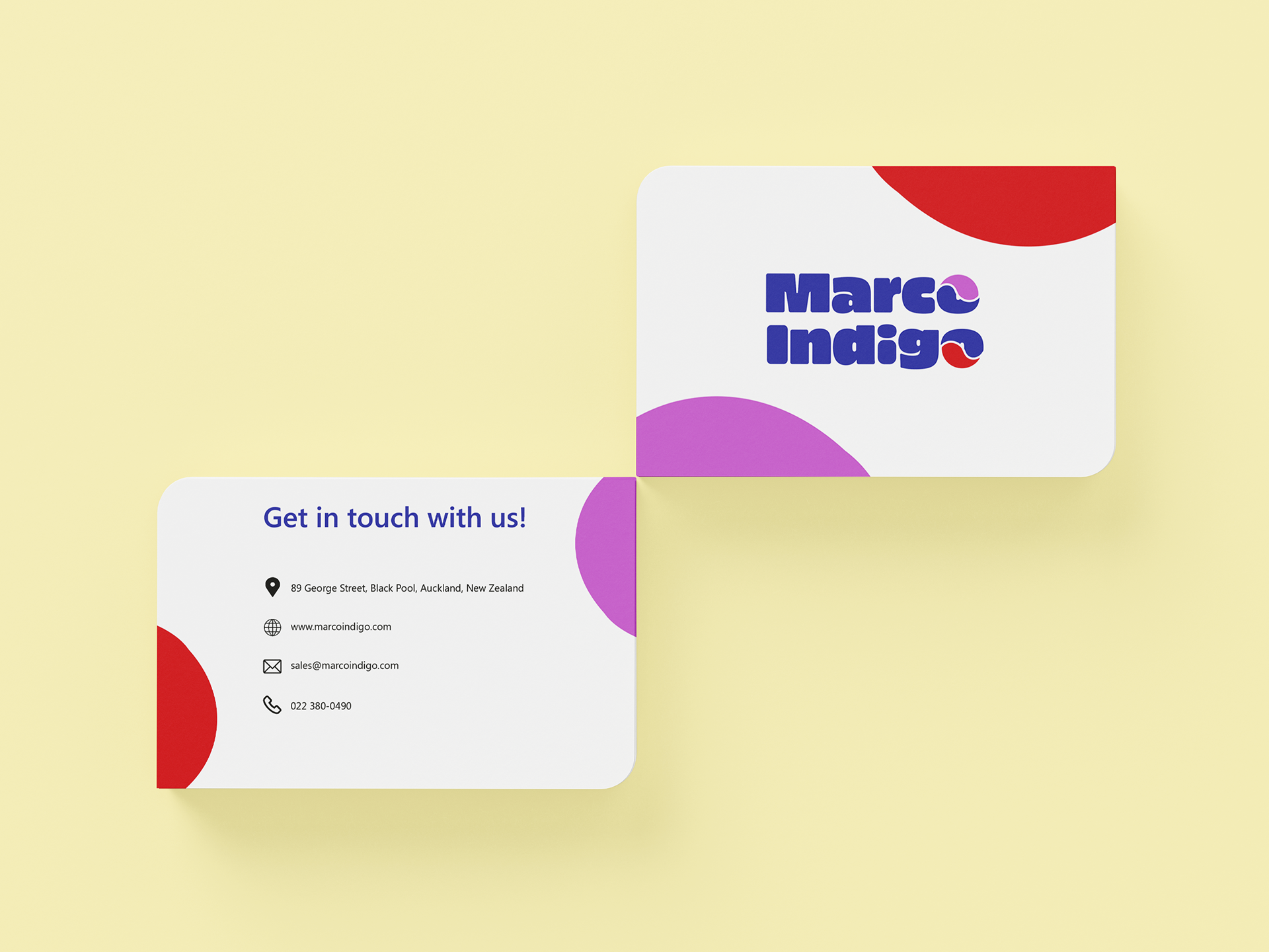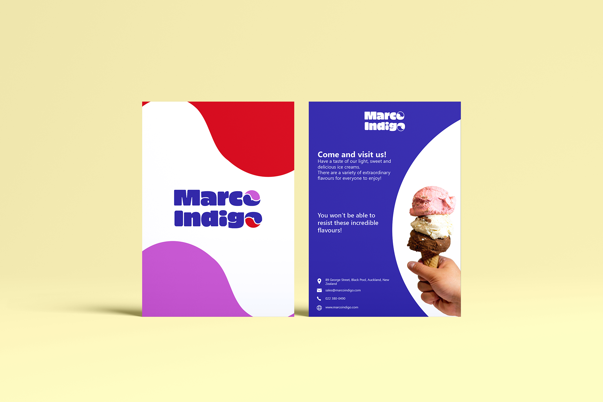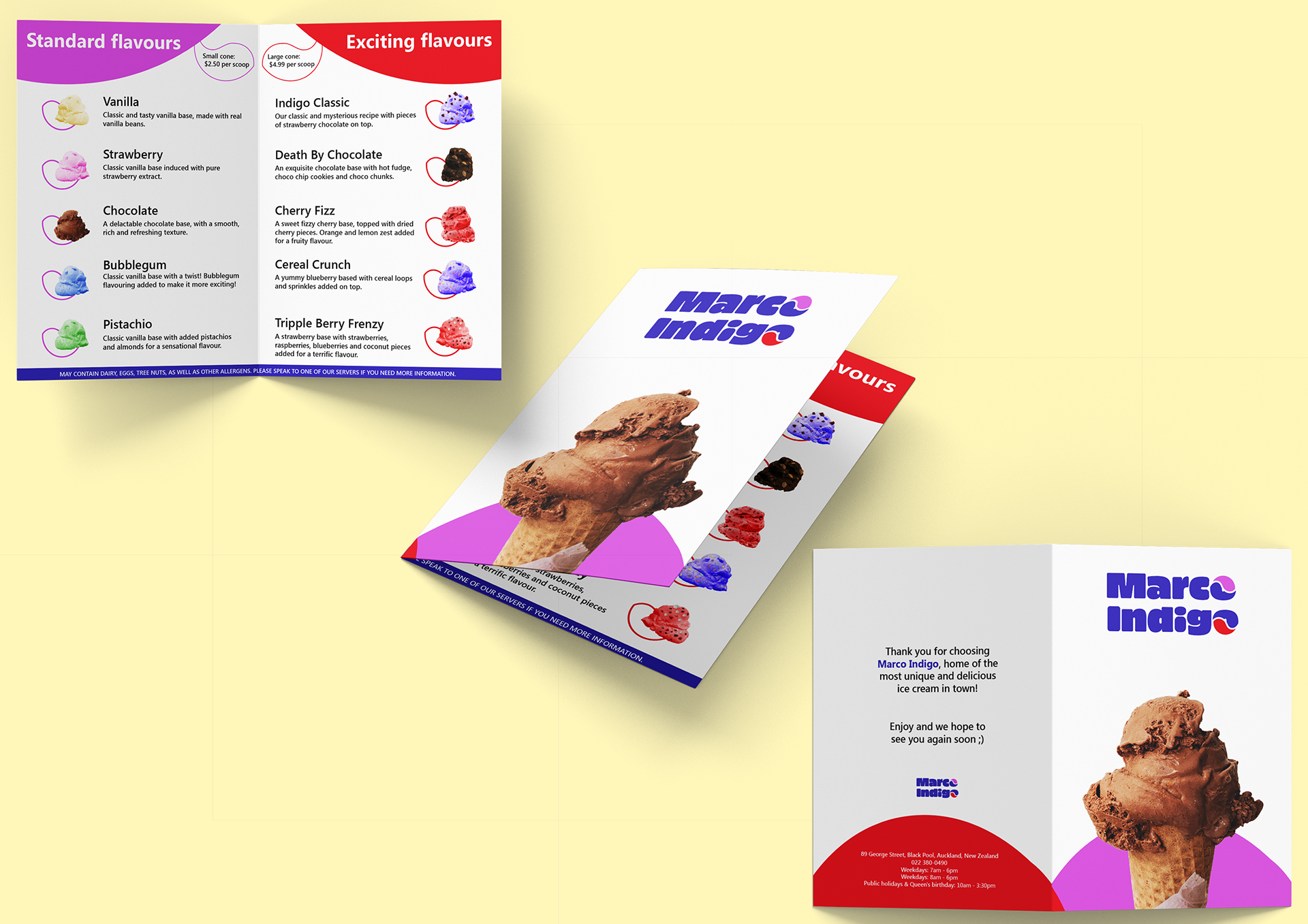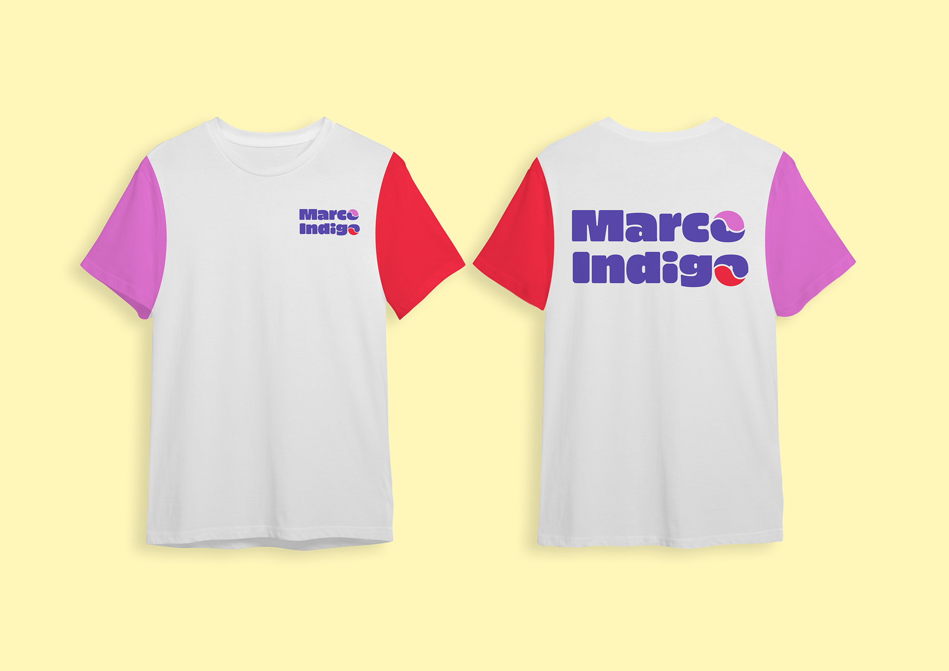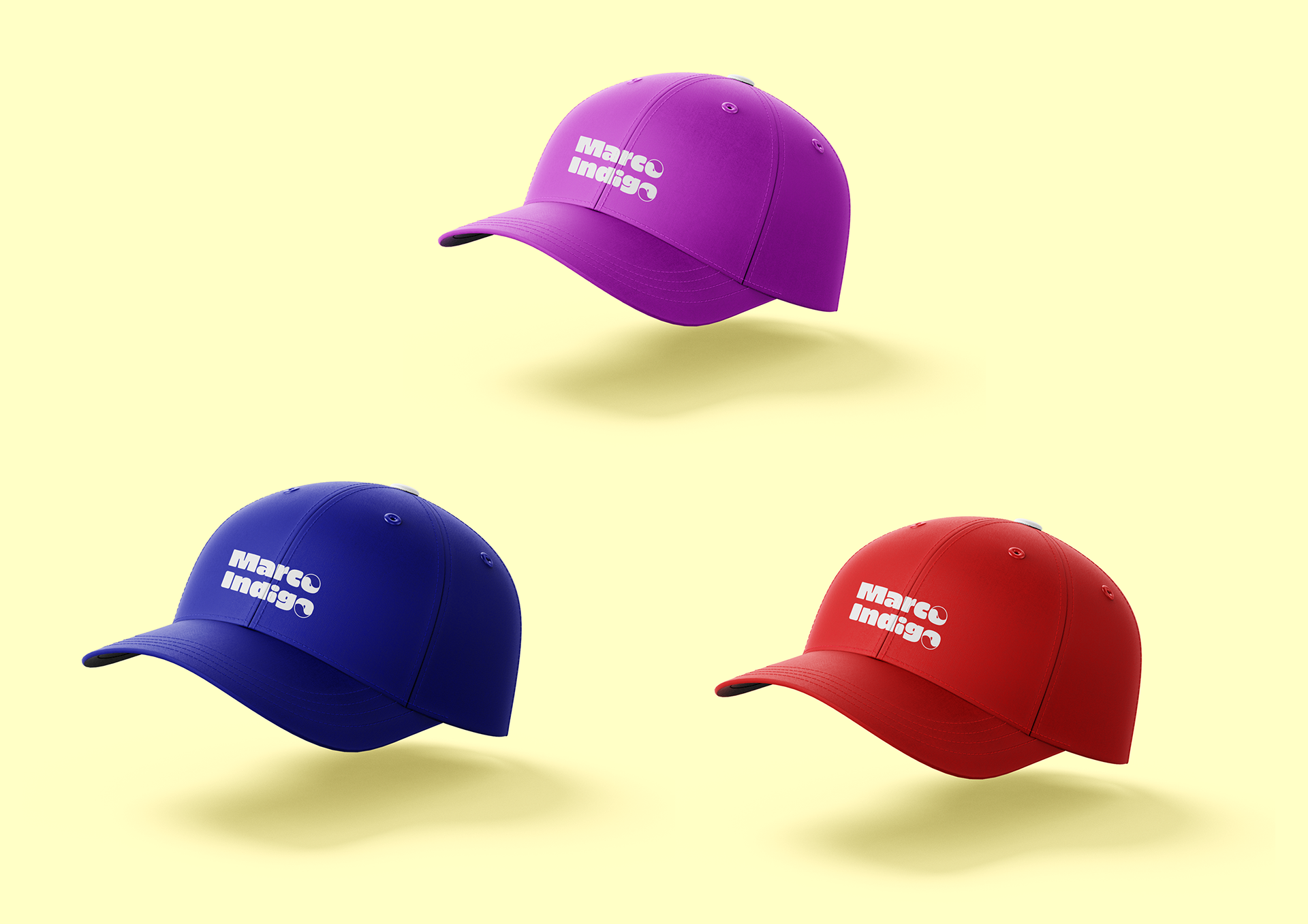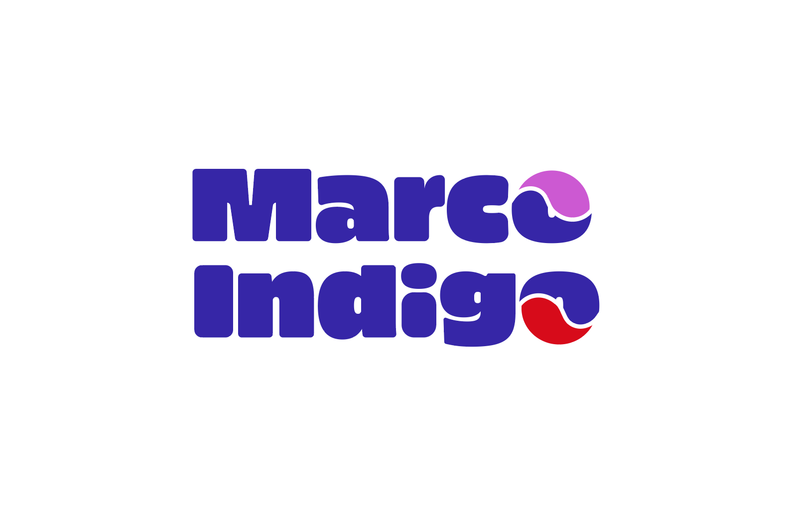
Client project
Logotype font: PiePie
Year: 2022

Brief:
Our brand is all about subverting the expectations you might find in the average ice cream shop. Ice-cream is always associated with pastel colours, and children – we are trying to keep that same fun, inviting, and playful idea but make it a little more grown up – we want to relay our passion about ice-cream to our customers! We want to bring this new sense of mystery about our store – we want people to come into our store expecting to be surprised – expecting to see something, new, mysterious, and exciting. This is a slippery slope though, we don’t want to drive anyone away – so a certain sense of gentleness would be required. Mainly, we want to prove that ice-cream is for everyone, not just kids.